2011年2月21日 星期一

The Printing Machine

After a Book Designs Project, we got given another project [it is similar to that as well, and is really what people do in "3D"], which the title of the project is "The Printing Machine".

This project we have to work in pairs, and we have to make a machine from things we collect, things through in the trash or things at your home that you don't need it anymore. Each group, each machine have to print out  a letter. My partner and I got given a letter "P" to print. The hardest bit of this project is that we only have 1 week to do so. Also due to we, as a group, both are oversea people.... which makes it even harder to find resources in this short period of time.

Though, at the end, we did find quite a few things, things like water bottles, wires, cardboard boxes, spunches....etc And luckily, we allowed to use things from other people as well, however, they are not very useful... Here ar some of the photos:


These are things form other people. The "P" shape above is made out of the plastic tubes i find on the desk. However, I didn't use it at the end....lol

So we decided to use the stuff we got to make this project work!! Here are the photos of us 2 making it=]]]:


The Machine we have made is really simple. It made out of cardboard, wires cured up to form 4 springs, spunches and the stripe at the end form my sports bag and profolio bag. It is powered by man. I'll stop talking now and show you how this machine work simply by the video below, enjoy;)


Book Designs

During the X mas holidays, we have been set to "create" 3 books from the briefing sheet. Here are some of my sketches in my sketchbook:


Because it is holidays, I didn't work as hard as I did normally. I end up only producing 2 designs out. The title for the 1st one is "The Book That Isn't There". And the other one is "The Reversing Book".

The Book That Isn't There

The idea is turning a book into a box, so when you open the book, there is nothing to read. The concept of a book is lost. so the book is really not there anymore. However, the idea of turning the book into a box is not a new idea, is actually quite an old fashion one. So by making it special, I decided I should craft some layers inside the box which I think it will make the box quite beautiful.

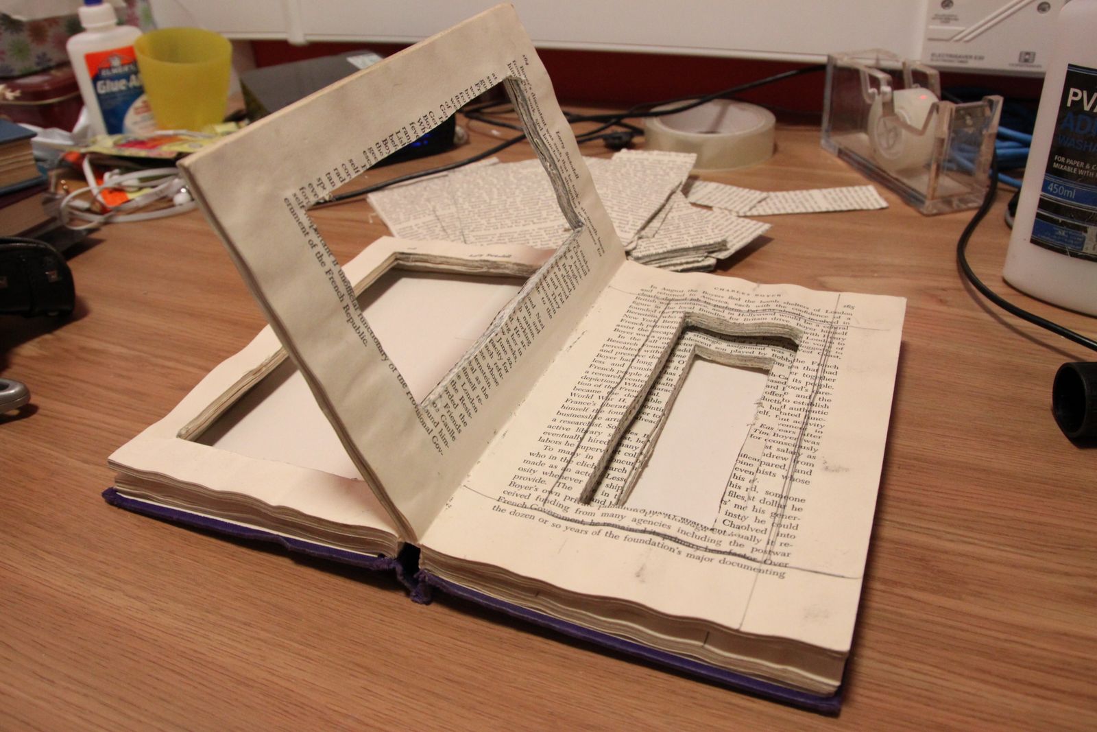
Firstly, I evenly separate "5 sections" in a book. Then I glued each section up, page by page. This is very hard work and took me ages and ages to do so. After that, I end up with 5 layers. For the layer at the start of the  'book', I cut out the biggest hole in it, then gradually cutting out a smaller hole. Therefore end up something like the photo below:


For the cutting process, It was very hard to cut them out because there are loads of glue in between each page. Also , by making it accurate, I carefully measured out the size of the holes by pencil and rule, so each of them are 5mm smaller than each other. Finally I glued the 5 layers up which finish making the box below:


Eventually, I chose to use it as a jewellery box because 'the book' is quite small and is not actually that deep. Therefore I think is perfect for a jewellery box. Though the only problem is you can't put much jewellerys in it due to the fact that 'the book' not that big...


However, because of the 1st time doing this, I haven't glue it carefully so the box is not that perfect. Beside, the book is too small orginally. Therefore, I made 1 more box from a bigger book. Here are some of the photos of that below:


The Reversing Book

The orginally idea of this book actually came from the title called "The Slow Book". It was by taking loads of pictures of my friend doing a lay up and some tricks shooting in a basket ball court. When you printed out in photos, put them into a photo-book and 'read' it, the man in it is actually moving in a slow motion so the book became a 'Slow Book'. However, I don't think this is good enough, so I added in 1 more idea into it~ I'll let you see the photos of the 'product' 1st:


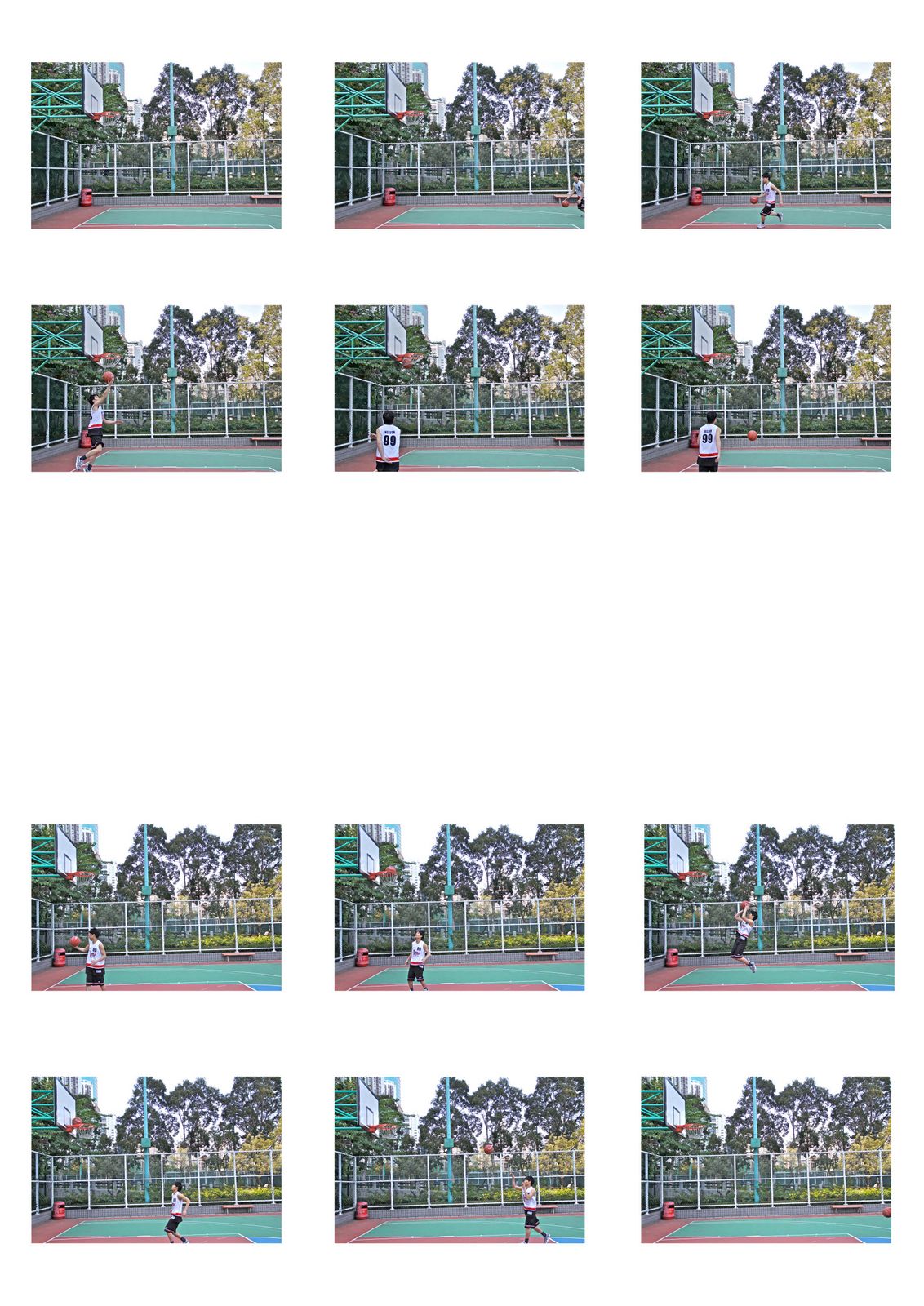
The Storyboard below is what inside the photo-book. The top half of the photo-book is the top half if the storyboard. And the bottom half of the photo-book is the bottom half of the storyboard.


Therefore, when you normally reading a book from left to right, the top half of the photo-book is actually moving the same direction. But the bottom half of the photo-book, in some sense, it is been read in a wrong direction because it is moving backwards. So you kind of having a reversing idea at the bottom half of the photo-book.

2010年12月11日 星期六

I See What U Mean (Part 2)

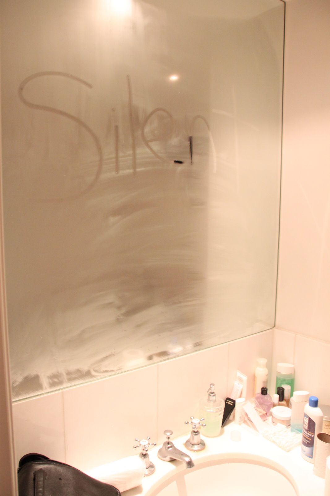
After all those hardworking typography in 9 days, we now need to merge the phrase in the poem to the environment. First of all, I just try out to put random writing on to objects around me. Here are some photos of them.


I used 1 of the design (the picture below) I did at the start of the project. I ignored "Who can say?" this time because it now makes the phrase not just short and sharp, also makes the word "silent" really stands out and provide a calm feeling to the people who look at it.


 The photo on the left is taken in my most favourite cafe shop in London. It simply meaning "it is silent now" because finally I can sit down and relax after a long week.


The phrase "it is silent now" is dissolving into the the coffee suggested that after I drank it, there will be silent.


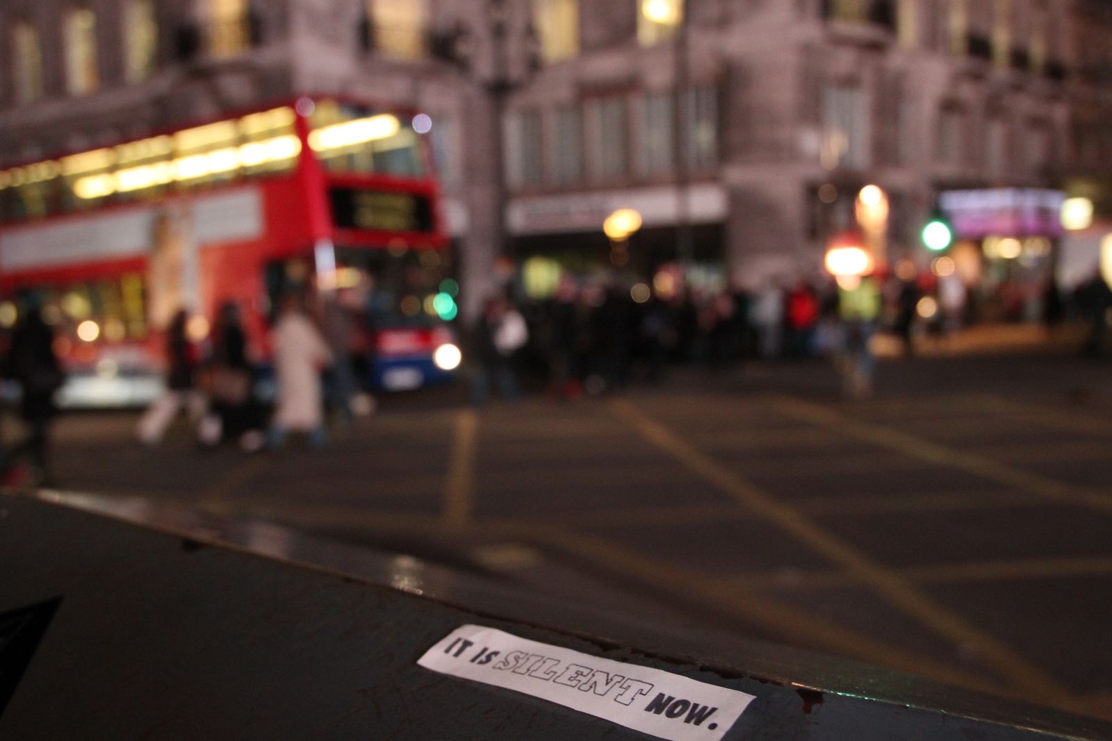
 By merging the phrase to the busiest street in London suggested the idea of "although it is very busy, noise everywhere, when you looking at the photograph, it is silent." Moreover, there's another meaning in them as well. The phrase actually merge with some of the dull looking faces of the people who walking by as I took the photos, which in some sense, it is really"silent now" for them compare with the environment around them.

I tried to photo shot the phrase as clear as possible and tried to make the background and the people at the background blurry as well. At the same time, keeping this phrase subtle in the photographs. However, the phrase in some of the photos didn't appear as great which some did gone blur.... But I photoshop with 2 of the best one (I think) I got=]


 Although the phrase in them are still slightly blur but I making the vision idea/ the meaning behind them are really strong. I think will probably find some software to fix the blur or just take more photographs later on.

2010年12月10日 星期五

I See What U Mean (Part 1)

The last project before X mas is about Typography. It is a 2 weeks project which at the start we all thought it is gonna be a very long dull weeks.... This is because it sounds really boring.
1st of all, we all get given some different word type sheets. We need to design 50 different designs from a phrase of out "favourite" poem. The hardest bit is we not allow to use any colour except black and white..... another difficult task but we just have to get on with it@@!!

Eventually I finish but I haven't done 50...... only got to 30 but I'm sure none of us did really get to 50 anyway~~~~ lol Here is the overview of all my designs:


Then we been told to choose 2 to develop onwards to make them a better design. Therefore I chose the top 2 on the right hand side. We been told that now we allow to use colours and we can do all sorts of things to make it stands out more. We can print it in A0 sheet if we really want to@@. However, because it is a really short notice that we can enlarge it as big as we want, I didn't manage to find a place that I can print out as big as A2 or A1.... So I only managed to print them in A3.... I think it still looks great, tho I think it will be much better if it is at least an A1 size~~~ oh well, anyway,, Here it is below this paragraph;)


I'm gonna talk about the left hand side one 1st. It is designed like this is because I was influence by Neville Brody. It is how he uses the red and how he attach the words together inspired me. So I used the idea of letters attaching to and letters to create a "repetitive sound" within the paper to make typography really interesting!! But because the positions of the words "can" "say" in the 1st design (the design on the top right corner of the 1st image) is not working well. So I scan them 2 the computer and photoshop it to clean up the bits that i don't want, just like the 1 below (left). 


After that I move the chain of "O" slightly to the left then scan in to clean up the bits that I over drew. The outcome of that is the image below.


Carry on, I drew the "O" chain that curving left to right is to suggest the transition when you are speaking that out loud. But then I find out that I should've start the "O" chain with a "o" (little) 1st because the letter "h" and big "O" (Big) don't fit in well together. Therefore photoshop it and scan ........ so on.


After I set the "base form" of the typography design, I started to experiment how to fit in the other words in from the phrase by cutting the letters and sticking them down on the design. Firstly, I chose to ignore the 2nd part of the phrase- "It is silent now." because it got no room to fit in this design and is no point forcing or otherwise the whole composition will go horribly wrong. Therefore finally, the 3 images below are my last designs for this part of the project and I chose the one with only the Little red "?" at the end.


I chose that is because the word "Who" is really dramatic on the sheet already. So the words"can" and "say" needed to be subtle in order to gain balance within the design. Therefore is pretty much small but sharp. If it is all in red, it will be too sharp. As a result, the only way is colouring the question mark in red. Cconsequently, it's not just bringing those 2 words out but also alerting the audience and urging them to think about whats the Question really asking.

I really enjoy doing typography and I didn't find it dull at all after all these hard workXD. But I wish I can print the finally 2 designs in a bigger version so I'll do that asap when I can find a massive printer. I'll talk about the final part of the project asap as well;)